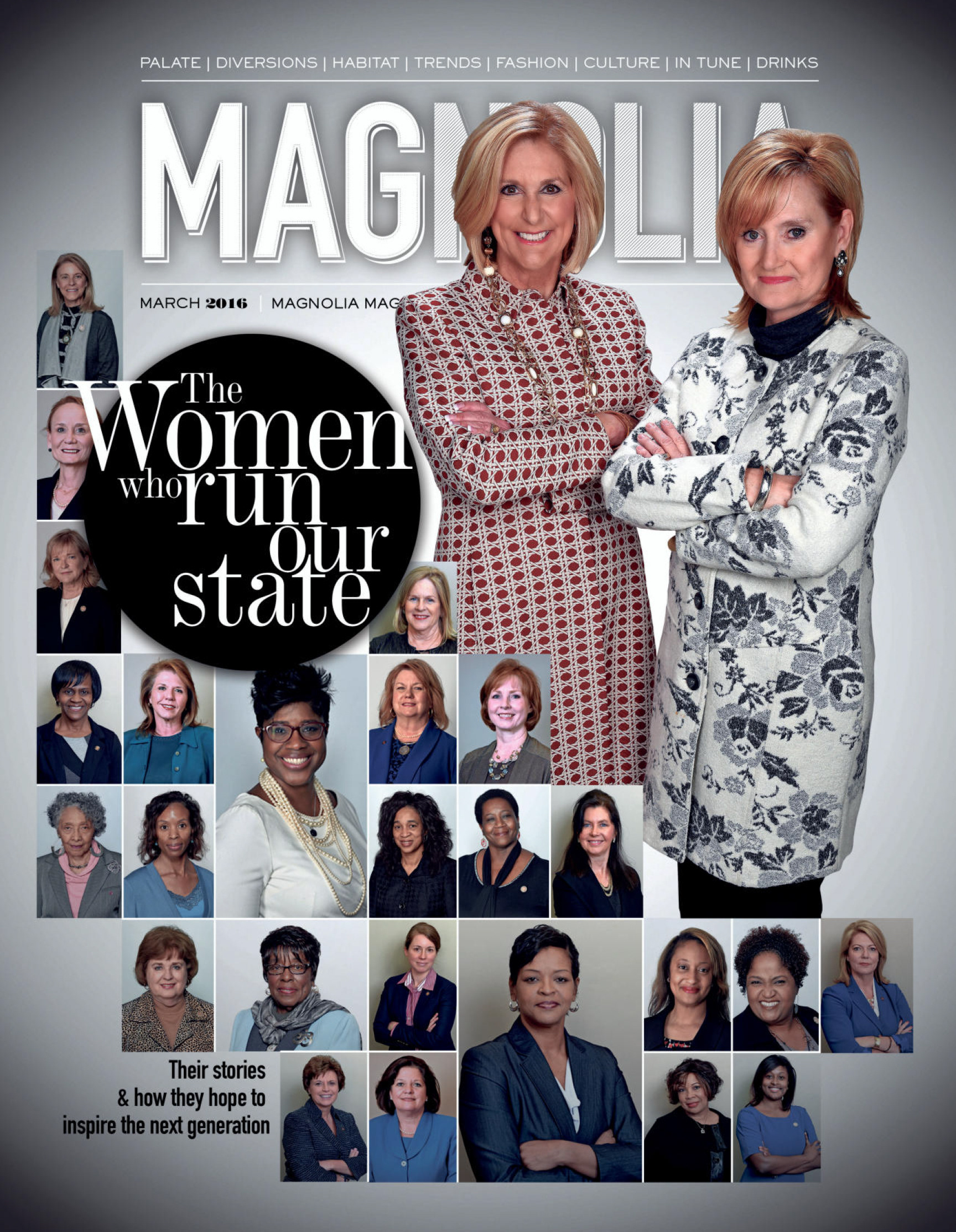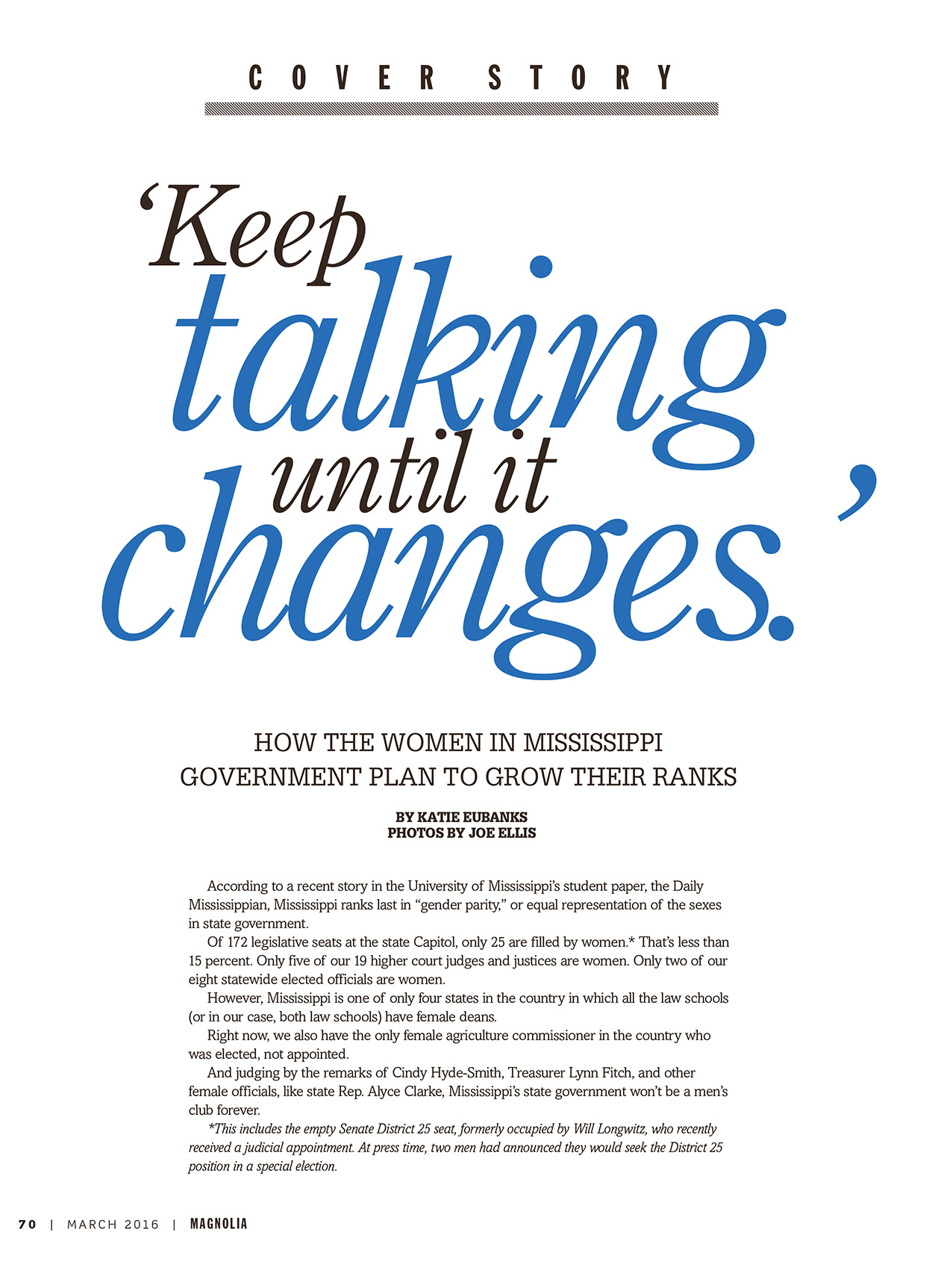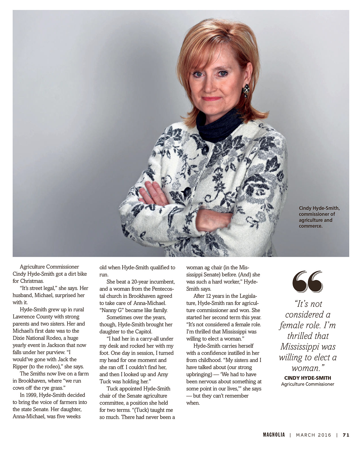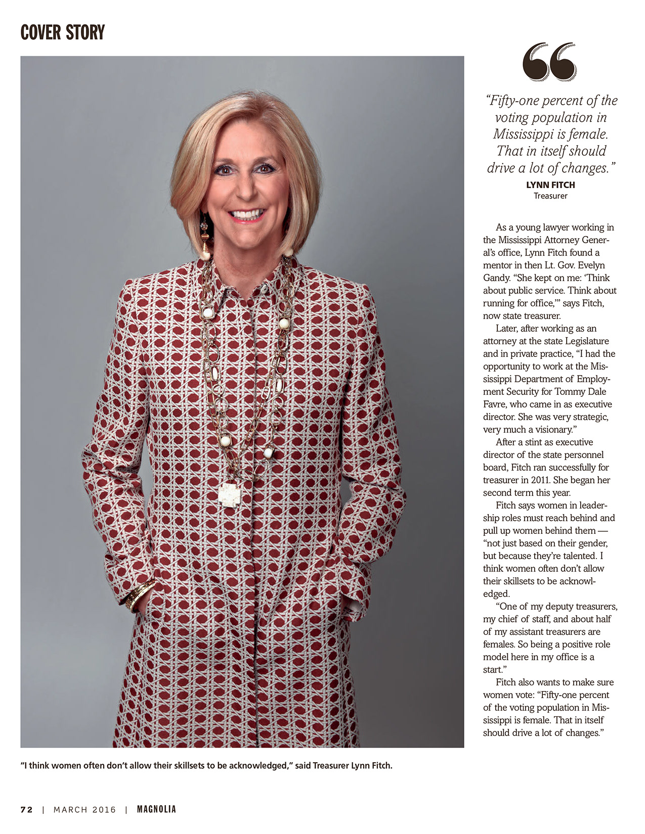


A designer never likes to hear, “We have roughly 30 headshots that need to run on the cover of this month’s issue. Can you create something striking with that?” Of course I can… if I’m given a little direction and creative freedom. This cover had the potential to be busy and unfocused. Not only did we find a strong focal point, we also provided diversity, movement and tight typography that delivered a clear and concise message. This style was also carried through to the inside pages, making an easy-to-read spread. This issue also features a few additional spreads that took chances with typography.
