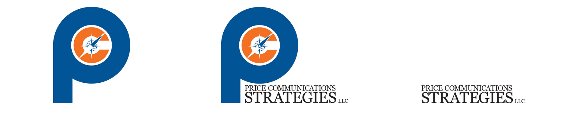
This logo was created for Price Communications Strategies - a start-up public relations company near Shreveport Louisiana. This LLC works for both public and private companies as a professional compass, purpose collaborator and political connector. The direction of the compass suggests progress while the relationship between the "P" and the "C" resembles a target. The number of characters in the lengthy name proved to be an interesting challenge.

I wanted the imagery to match the name. I converted a photo I shot of a dog to vector image of simple positive and negative spaces. The high contrast provides a polished look. The symmetrical imagery and clean typography helps drive home the idea that Polished Pug provides clean, sophisticated design built on the belief that foundation comes first and frills come second.