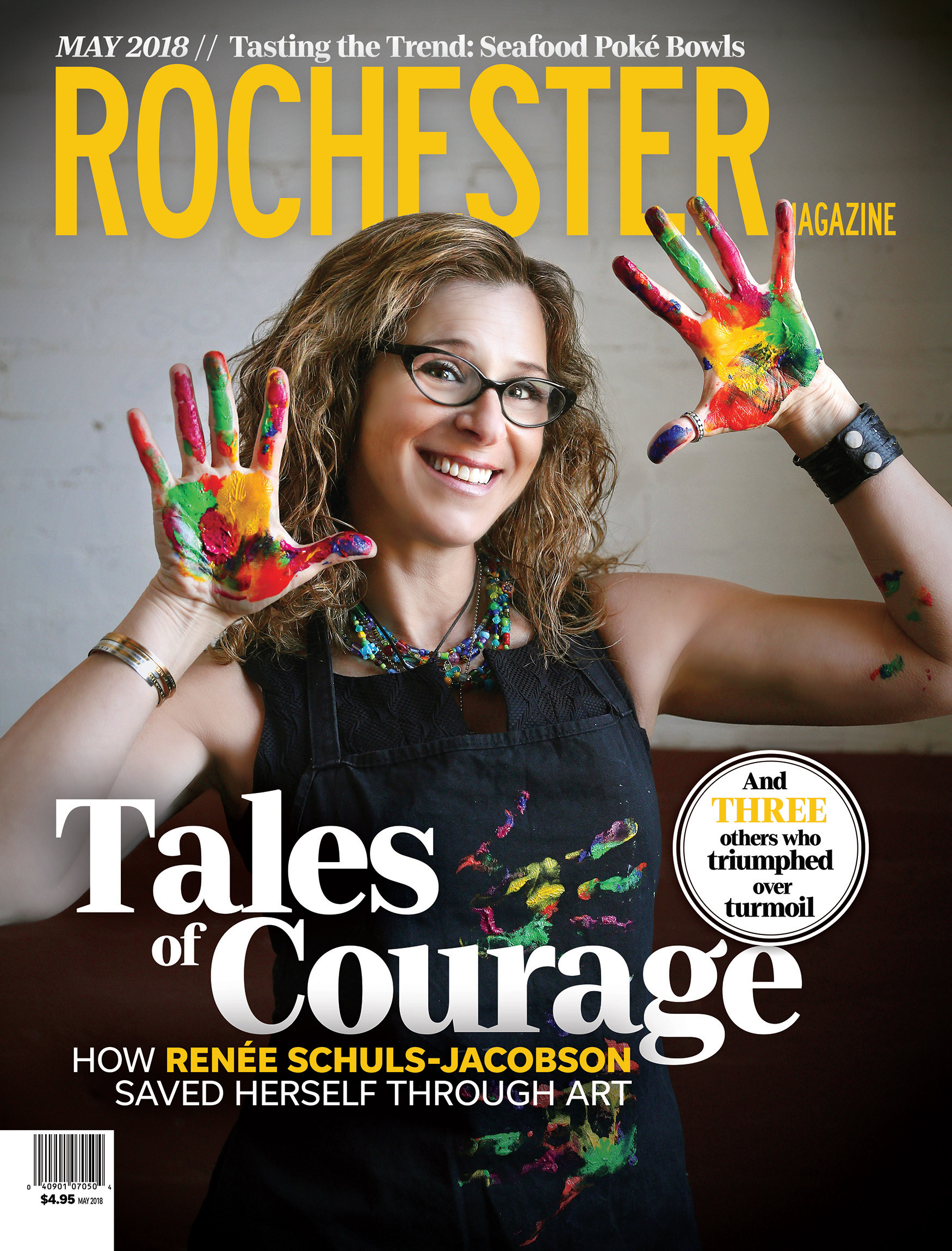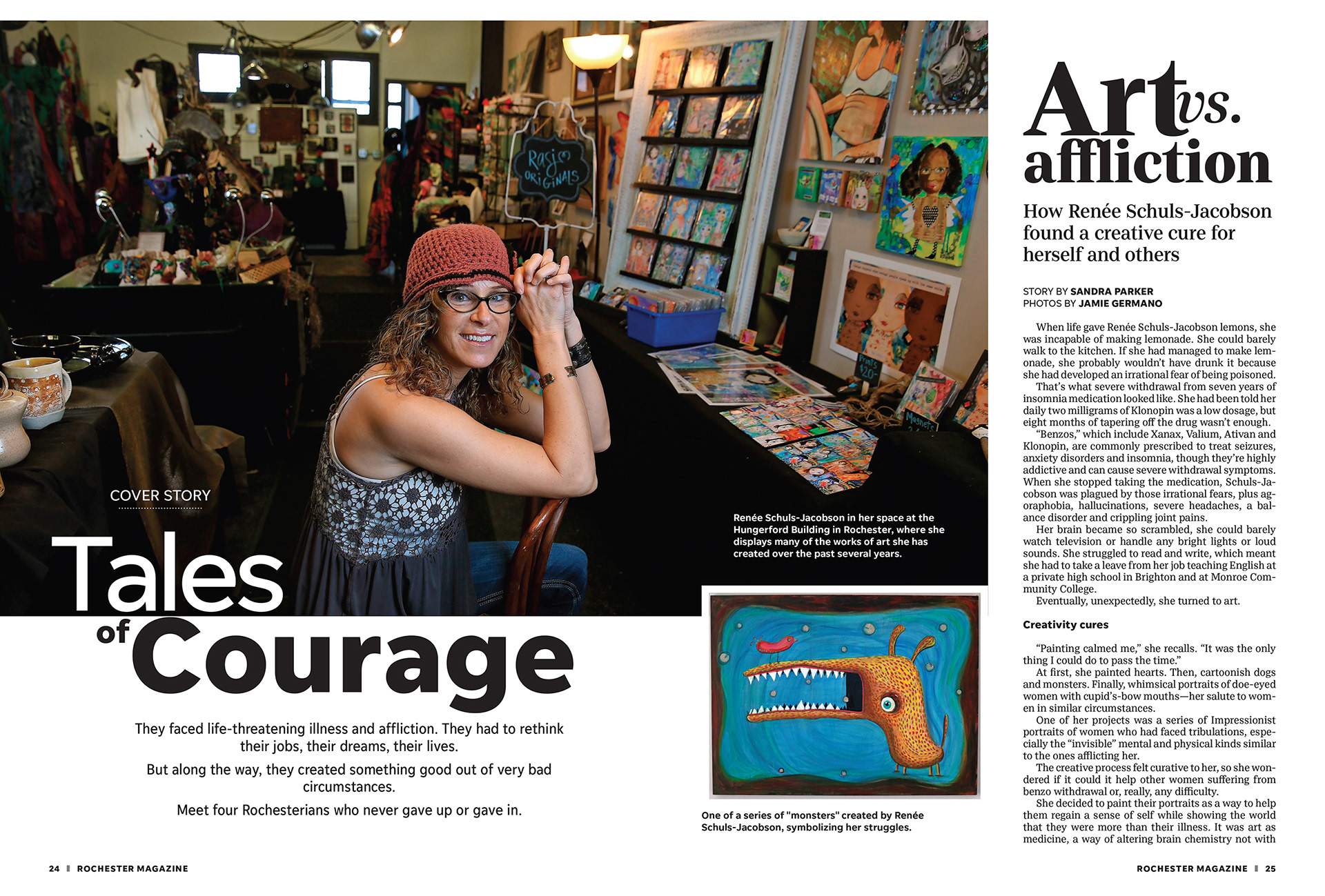


This issue focused on a local artist who never gave up or gave in. The editor was looking for a strong image to carry the cover. Several versions of similar photos were provided for the cover and after much back and forth we landed on the one you see. I pushed for this version for a number of reasons… the subjects expression, the position of her arms and the neutral background and how it contrasted the colors on her hands and apron. All these elements along with solid typography and good use of color made a visually satisfying cover. While you may start at her face, the yellow provides visual cues and pulls you through the rest of the page.
